
I have decided that I am going to try my hand at art journaling. I'm not sure what I will be doing. I have been told by many people that you just go for it and put down what you are thinking at the time. So for now I am going to show you how I did the front cover of my journaling book. It is mixed media style using a lot of "stuff" from my stash along with several colours of Finnibair's Alchemy metallic paints. I will show you some of the steps to achieve the cover.

First I applied heavy white gesso on the entire surface of the cover. I put it on pretty thick as I wanted to create a lot of texture. I used my spatula to create the ridges. This had to dry for several hours because of the thickness. When the gesso was dry I applied a crackle paste from Golden directly onto the gesso and let this dry again for several hours. It cracked really nicely and again added more texture.

After the crackle paste dried I stencilled on some modeling paste using a couple of stencils.

When everything was completely dry, I painted the entire surface using black gesso. I then selected the various items that I wanted to add to the cover. The picture below will show you the items: wood decorative pieces, wood flowers, metal large decorative lock, chipboard heart and leaves, resin flowers, metal key and gear and acrylic buttons for the centre of the wood flowers and squares of chipboard. I then painted all the items with black gesso.

The next step is the one that I love the most - layering the various paint colours onto the entire surface. I first started with steampunk copper. I dry-brushed the colour onto the surface here and there and then I followed with mermaid teal. Below is a closeup of the first two colours.
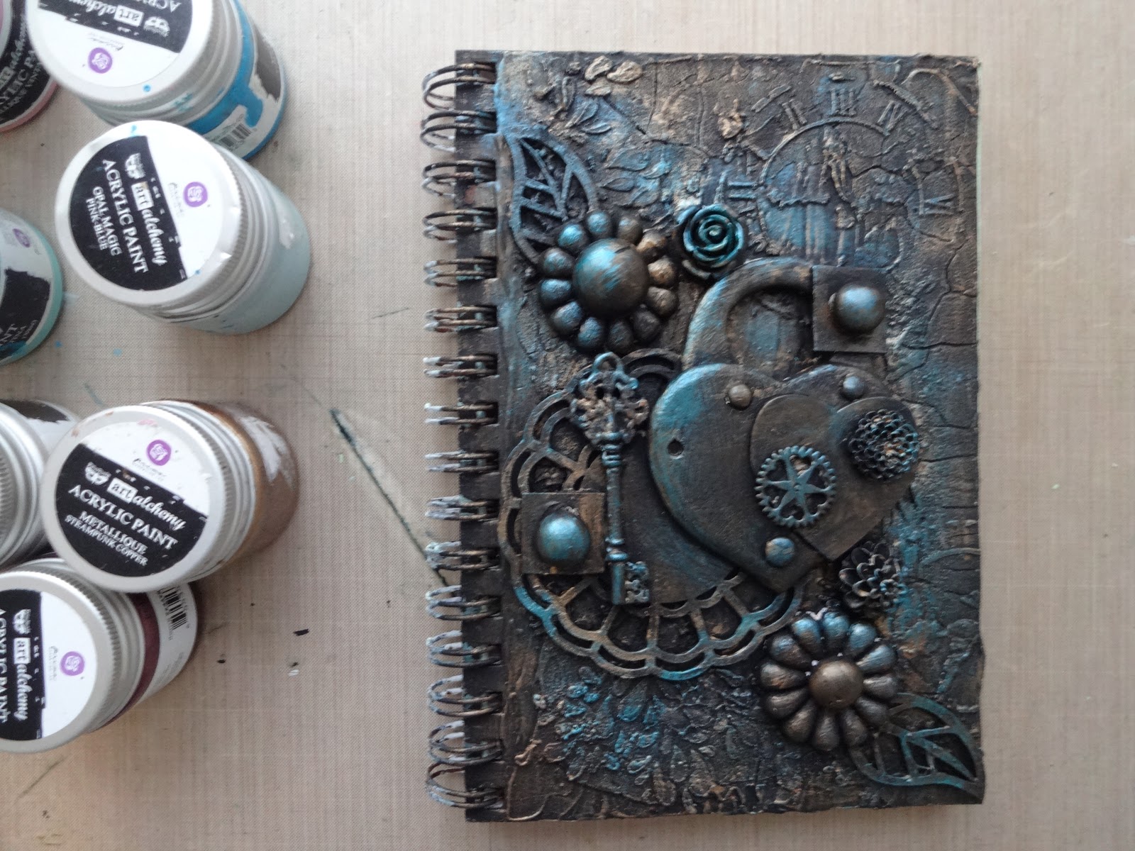
From here I continued dry-brushing more colours. Next was light patina, then vintage rose, fairy wings, white pearl, and plum preserves. Lightly applying each colour is very important. The next picture was after the vintage rose was applied.

After all the colours I wanted were applied using my finger and only on a few of the raised surfaces, I applied a bronze metallic rub from ArtO. I used a gold rub again very sparingly onto raised surfaces.
Here is a closeup of the centre section of the cover so that you can see the colours. It turned out amazing and the metallic in the colours really shines. I added a yellow glass button that you can see at the top of the lock for extra accent.

And there you have it. The key - do not try to be too perfect with the colour application. Just brush on here and there and keep going.
Until next time this is Donna wishing you a safe and happy week.
HAPPY SCRAPPING
Success lies in the journey - not the destination.